We haven't had any original series discussions in quite a while - so here's something to talk about
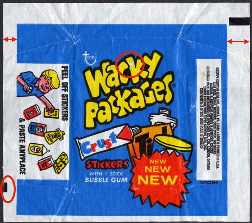
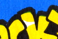
While sorting through some old blue wrappers the other day, I again recalled a vivid memory of ripping open packs of 6th and 7th as a kid and wondering about a white triangular spot in the K on some of the packs.
I mentioned this on the other forum a long time ago, but I had no pictures to show what I was talking about. So, at the time it was dismissed as probably nothing more than poor quality control at Topps, and akin to the dust rings in the black borders. (i.e. nothing special)
Somewhere in the years since that post I picked up several of these 'special K' wrappers without realizing it. Looking at them recently with fresh eyes, I now believe that these are true variations, and not just bad QC.
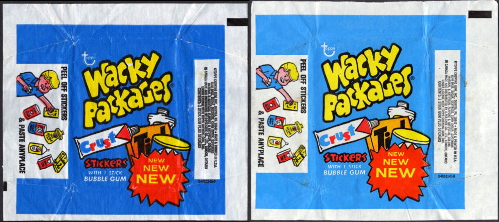
Two things really stand out with these wrappers: the first is that white triangle in the K in Wacky. The second is that the colors are saturated, with heavily printed ink, and using a deeper shade of blue than the other 462-21-01's.
To me, the clincher of what makes this is a variation though, is that these wrappers have a second black guide line located at the lower left. No other Wacky wrapper that I've seen has that second black bar (time for everyone to dig through their wrapper piles looking for guide marks!). And for the most part, Topps never uses a second bar on their wrappers. (I've found two exceptions out of the scores of wrappers across the decades that I've looked through. And for both titles, all the wrappers that I found have two bars, which would indicate they're meant to be there).
The entire image on the wrapper is also shifted right, to provide room for the black bar. I don't believe this is the result of a mis-cut, but intentional. I haven't seen many packs though, but it's possible that the folds of the wrapper are also offset to the right in order to keep the image centered. I'll leave that for the pack aficionados to figure out.
Whether any of this is enough for folks to want to have an example in their collection, I'd be curious to hear.
For fun I looked at Greg's site to see what images he has posted. His pic of the unfolded 462-21-01 is the pale blue variety, while his pics for the 6th and 7th series packs are the white triangle variety.
http://www.wackypacks.com/wrappers/0-462-21-01-3_small.htmlhttp://www.wackypackages.org/packs/6th_packs.htmlhttp://www.wackypackages.org/packs/7th_packs.htmlThe white triangle in the K. Colors and contrast exaggerated to make it stand out.
Side by side of two 462-21-01 wrappers, to show color and saturation differences
highlighting the unique points of the variation wrapper